Resources
Brand Kit
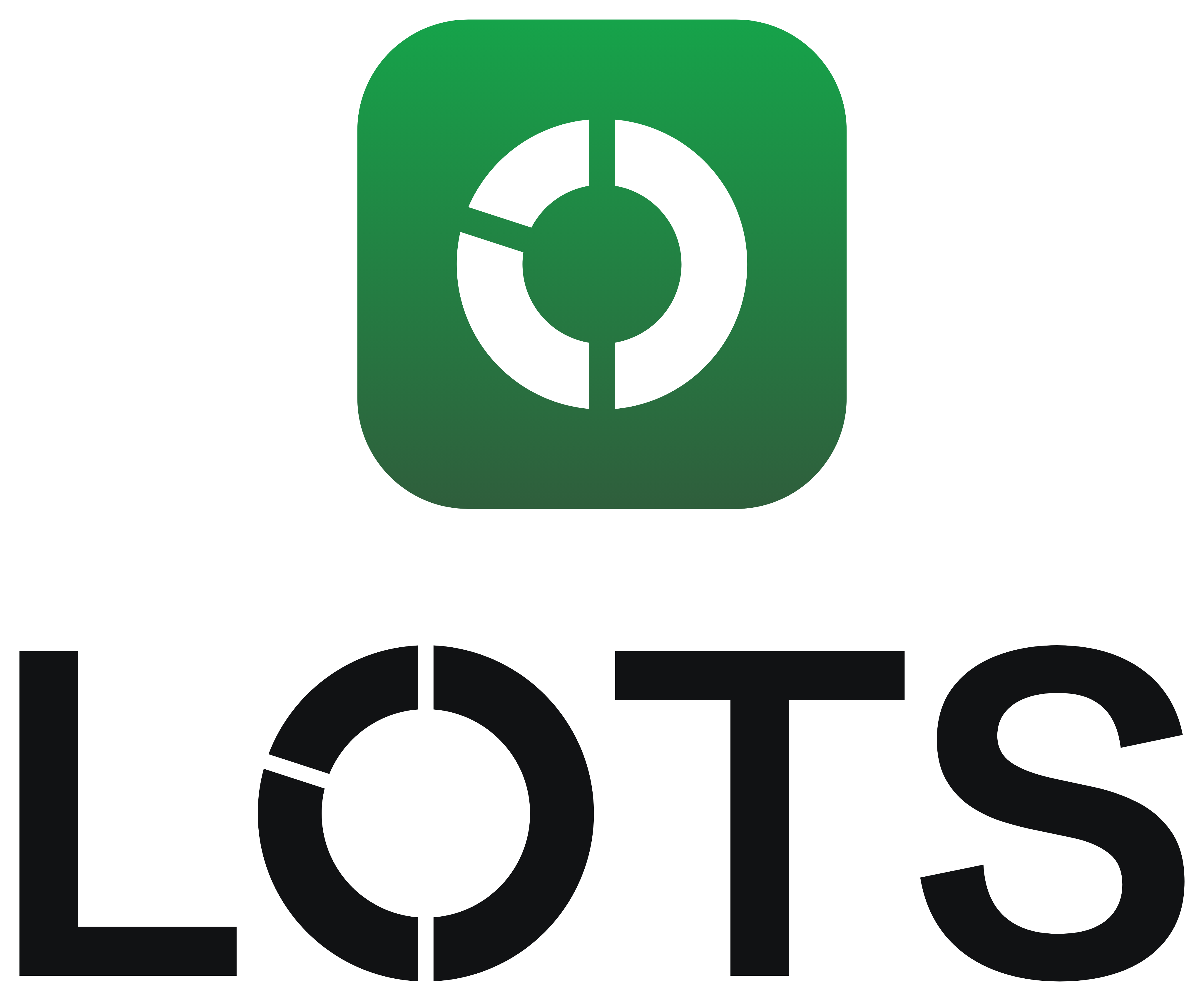
The symbol is the O: a white ring on the brand gradient. Use the gradient from 32px up and flat green below 32px. Keep clear space equal to the height of the O, a lockup at least 96px wide and the symbol at least 20px.
Colour
Ink
The default ground
Paper
Light ground, and text on ink
Green
The one green: logo, lead arc, live, gains
Green ink
Primary buttons, green text on paper
Deep green
Gradient end, on the symbol only
Brick
Losses and failures only
Brand gradient
180° · #16A34A to #2F5E3C · symbol, app icon and hero moments only
Bundle palette
Ten categorical slots for Lot rings and bars. The lead segment is always green, and a segment’s colour never means performance. Values follow the active theme.
Type
Display and interface
Compose the assets. Launch the narrative.
Schibsted Grotesk sets everything from display to UI, at medium weight with tight tracking.
Figures
1.070000 SPCX
0x7a3f…c21e · $412.08
Geist Mono handles amounts, addresses, eyebrows and code, in tabular figures so columns line up. Every amount shows its denomination.
Usage
Always keep the gaps
The O is a Lot: distinct assets composed into one form. A closed O is just a letter.
One green, never red
The lead arc carries the brand green. Arcs never show gain or loss.
Gradient on the symbol only
Never behind text, on buttons or in data.
Green text on paper is #15803D
#16A34A passes on ink, not on paper.
Colour never works alone
Status colours always come with a label or an icon.
No birds, feathers or arrows
Nothing that echoes Robinhood.
Downloads
Each logo comes as an SVG, which stays sharp at any size, and a 4096px PNG for anywhere a flat image is needed. The app icon comes in the sizes platforms ask for.